

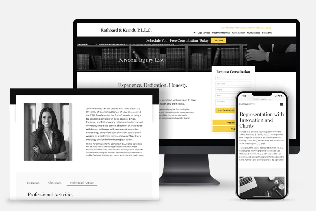
Your law firm’s website design should be distinct, professional, and authoritative
Standing out in an increasingly competitive marketplace is one of the primary challenges for any law firm. There are tens of thousands of lawyer sites out there, and many have similar branding, compete in the same spaces, and feature sites impossible to distinguish from one another. It’s easy to get lost in the noise.
You need to be distinctive enough to be noticed, while providing a unified and professional experience to your clients as part of an overall marketing strategy. While designing a high-quality website is as much an art as it is a science, there are certain steps you can take to ensure yours stands out among its peers.
Clean & Engaging Design
You will notice in your own browsing that the less cluttered a site is, the more professional it seems. You want to strip your site down to its essentials, and present them in a sleek, attractive package. Extraneous bells and whistles are exactly that, extraneous, and should be left out.
There are good reasons for this design choice. The first is simple aesthetics: a clean design portrays simple elegance. Think about minimalist office design. While more cluttered fashions go in and out of style, minimalism is perennially desirable. The same principle applies to your online real estate.
The cleaner your site is, the more quickly it loads, and the better it works on a variety of devices. This directly impacts SEO as search engines take these factors into account when assigning rankings. Visitors prefer sites that load quickly, with the slow loaders shedding the bulk of their traffic after three seconds of waiting.
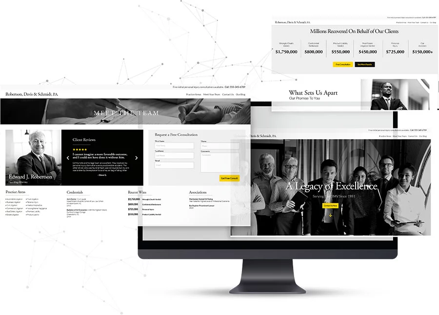
Your website should be clean, easy to navigate, and clearly show your potential clients the most important information about your firm.
Clear Navigation
Along with a clean design, your page should be easy to get around for visitors. They should have a clear understanding of where every link goes before they click it. Strive for clarity, prioritizing the parts of your site that contribute directly to lead generation.
While everything needs to be easily findable, your contact information and CTAs should be especially apparent. Your site exists as a portal to your firm that ends with contact by whatever method is most comfortable for a visitor. If a visitor does nothing but scan your page, they should find your CTA that links to a lead generation form.
While the urge to be extra creative with your menus may strike, you want them to be something your visitors can use without a thought. Leave your creativity with your marketing copy and trust the instincts of experienced internet users.
Mobile-Friendly
In a trend only growing more pronounced, the bulk of web browsing these days is done via mobile devices. If you’re going to compete at all, your site needs to be optimized for mobile devices. Most of your visitors will be encountering you for the first time on the screens of their smartphones and you need to make a great first impression.
Your best solution is to use a responsive website design, which detects what device a visitor is using to access your site and loads the version optimized for that experience. The days when you could get by with only a desktop version of a site are long gone.
Regardless, you need to extensively optimize your site’s mobile experience. Test everything on multiple devices to ensure you’re always putting the best foot forward.

Modern websites must be optimized for mobile: 55% of all web traffic originates on a mobile device.
Minimize Pages
This point goes hand in hand with point two. One of the easiest ways to simplify your navigation is to cut down on the total number of pages in your overall site. As with every other tip, consolidating your pages and removing unnecessary sections helps SEO, user experience, and conversion rates. About 40% of visitors will leave after seeing only a single page, so make it a good one, like a personalized landing page with a lead form.
After minimizing pages, your visitors should be able to find what they came for more easily. The primary destinations are going to be your contact pages, lead submission forms, and your content library. Don’t hide them behind layers of pages.
One of the easiest traps to fall into is the idea that everything is necessary. Faced with too many options, visitors can fall into decision paralysis, opting instead to close your site and find something simpler.
Continuous Testing
Testing should be a rigorous process whenever a change is made. First, you want to test the impact of potential changes with A/B testing. Determine if the change is better than the status quo, then test iterations of the change. Each test gives you hard data on what works and what doesn’t.
After you implement any change, you will want to follow up with extensive QA testing to ensure everything works as intended. You have to test with as many devices as possible, as something that works fine on one platform is a disaster on another. Once you’re finished testing, test again.
Calls-to-Action
Every site exists for a user to take a specific action. In your case, it’s to contact your firm either through phone call, email, or lead submission form. In the case of the first two, your basic contact information should be easy to find on every page.
Your CTAs should lead to lead generation forms. Simple prompts, like “Schedule Your Consultation” are ideal for driving traffic. The forms themselves should be simple, asking for the minimum of information you need to follow up. The more you ask for, the more likely a visitor is to leave before submitting a lead.
Creating your buttons in contrasting colors with slightly larger fonts is a good way to stand out without spoiling the overall elegance of your design.

Your Call-to-Action elements should be enticing and easy to understand. Make sure they are bold, clear, and accessible throughout your website.
Track everything, including phone calls
Tracking user behavior on your website is critical to knowing which parts of your site are performing well and which need to be optimized. Every interaction on your website should be accurately tracked and measured including page views, button clicks, form fills, and phone calls.
Phone calls are a special case when tracking website performance. Analytics applications such as Google Analytics have no way to know when someone has picked up their phone and called your firm, because the action takes place outside of your website. To track phone calls that originate from a user on your website, you’ll need a call tracking program integrated with your analytics.
With Lead Science call tracking programs, you gain access to separate phone numbers that can be assigned to different marketing channels or campaigns. Your website visitors will be shown unique numbers that tell you where, when, and how these visitors decided to call your firm. You can even apply call tracking numbers to campaigns that occur outside of your website, such as a print ad or search ad, so that you can accurately track your campaign performance.
Font Choice
Every decision in website design matters, no matter how minor. A font has the potential to make or break your site; if a person has even the slightest struggle reading the content of your page, they are as good as gone.
Quality website fonts are clear and easy to read. Colors should contrast with the background color of the page (this is very important, particularly for visitors with visual impairments) while text size should follow a clear hierarchy for headings (larger text used for page and section titles) and body text (smaller text that makes up the bulk of your page content).
Font decisions, part of a design discipline known as Typography, will be critical in developing the overall aesthetic of your website. While true mastery of this aspect belongs to professionals, you can apply the basic principles to your own website by ensuring all your text is clear and legible, with a sizing structure in place that puts an emphasis on your most important information while allowing readers to easily digest the rest of your content.
Your text should be easy to read, contrast with the background, and use a clear hierarchy of sizes to help guide readers to the most important information on each of your pages.
Partner with Lead Science: The experts in web design
While these tips can get you started, there is no substitute for experience. Our web designers at Lead Science have years of experience in building sites that stand out from the rest while generating a steady intake of leads.
Once your new website is live, our proactive account team is dedicated to optimizing your website’s performance. Through continuous monitoring and analysis, we identify areas for improvement and opportunities for growth. We partner with you to develop customized optimization strategies to keep you ahead of the curve and make informed decisions that drive better results.
Schedule your Lead Science discovery call today and we’ll walk you through how we can maximize the lead generation potential of your website.